We asked experts at Benjamin Moore and BEHR to share the paint color pitfalls they see most often — and how to avoid them.
1. Skipping the Sample Step
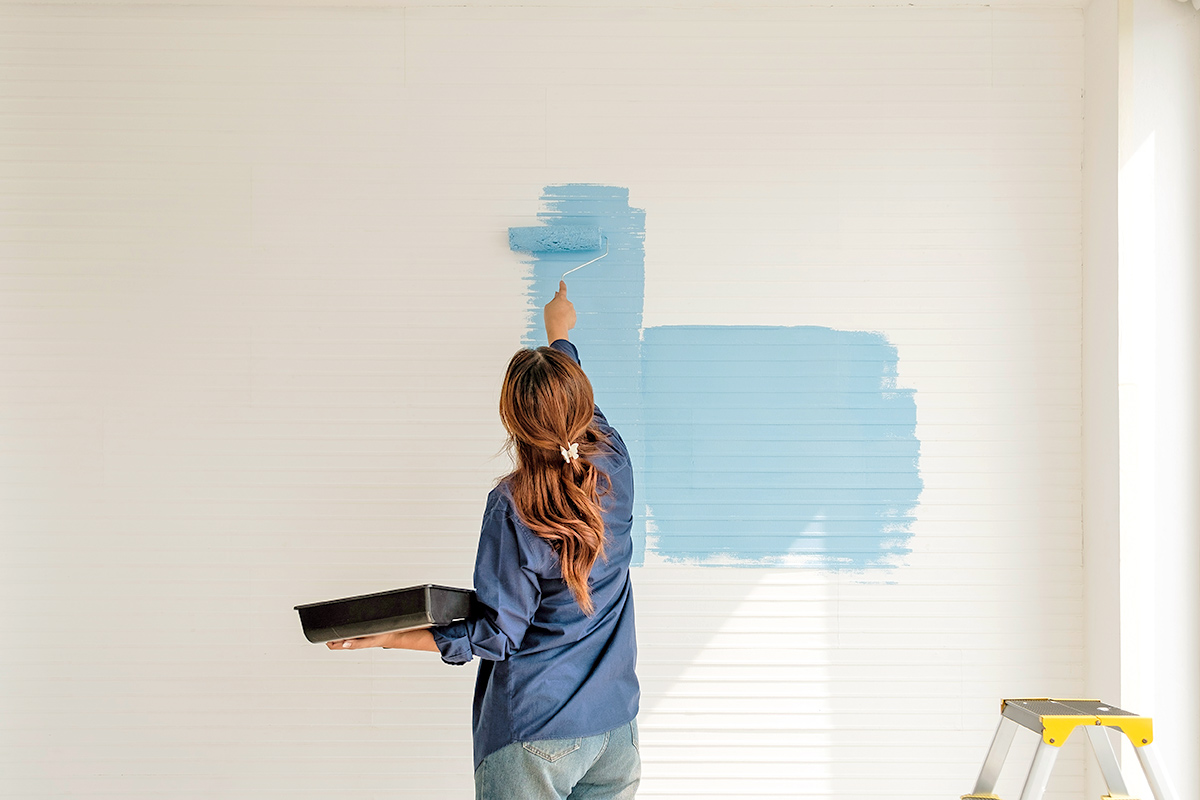
It’s tempting to order a gallon of that gorgeous color you spotted online and start rolling it on your walls without much thought, but paint experts say this is the fastest route to regret. “Color is reactive, meaning the various design elements in the room like lighting, flooring, furniture, and accessories can all affect how the color casts,” says Arianna Barone, color marketing manager at Benjamin Moore.
Before committing to a color, Barone recommends brushing a sample onto a piece of foam board. This allows you to easily move the board around the room throughout the day to see how the color evolves as natural light changes.
Kayla Kratz, senior director of color and design strategy at BEHR, agrees. “A shade that feels soft and calming in the morning may look cooler or deeper by evening,” she says. “The time spent observing is what builds confidence in the final choice.”

More from our network
House Outlook is part of Inbox Studio, which publishes content that uplifts, informs, and inspires.


2. Buying a Paint Color Because It Looked Good in Someone Else’s Home
Just because you have a folder filled with dreamy dusty-mauve dining rooms for inspiration doesn’t mean you’ll love the way the shade looks in your space. Lighting conditions, ceiling height, and existing finishes all change how a color reads.
Barone notes that even a color you’ve successfully used before can behave differently in a new room. If a sampled color isn’t landing quite right, treat it as useful information rather than a dead end. “If the color looks warmer in your home, look for colors that are similar but lean slightly cooler,” she says. “Sometimes knowing what you don’t want in a paint color can be as helpful as knowing what you do want.”

3. Ignoring the Fixed Elements in the Room
Kitchen cabinets, hardwood floors, and tile you don’t intend to replace anytime this decade all influence how a new paint color will look and feel. In fact, fixed elements can be one of the best starting points for color inspiration. Paint works best when it’s considered alongside the details already in place, Kratz says. “When these pieces share a common warmth or coolness, the room begins to feel more cohesive.”
One of the most common errors Barone sees is paint shoppers accidentally amplifying a feature they were hoping to downplay. “If you have honey oak kitchen cabinets and want to minimize the orange undertones in them, bringing in blues and cool grays will do the opposite of that,” Barone explains. “Color reacts to its surroundings; it needs something to compare. You want to bring in warmer paint colors so the cabinets don’t feel quite as warm.”

4. Playing It Too Safe
Don’t reach for the tried-and-true greige just yet. A too-safe paint choice can leave a room feeling flat, and pushing past your comfort zone — even slightly — is often what makes a space feel like you. Not sure where to start? Kratz recommends expressive, nature-inspired shades such as warm terra-cotta, smoky sage, or rich blue-green tones.
“Deeper, moodier tones can bring a sense of intention to a room, especially when balanced with warm neutrals, natural materials, and layered texture,” Kratz says. “Often, the spaces people connect with most are the ones that feel personal rather than overly cautious. Sometimes the color that feels like a small leap is the one that brings the whole space to life.”

5. Choosing a Color Based on Trends
Trust your instincts over the algorithm. A color might be everywhere right now, but that doesn’t mean it’s right for your home — or that you won’t be itching to repaint in a few years. Both experts recommend starting your paint color search with the feeling you want a room to have before zeroing in on a specific shade. A soothing bedroom and an energetic playroom will call for very different results.
“It helps to ask how you want the room to feel: calm and comfortable, warm and welcoming, or more layered and expressive,” Kratz says. “When a color supports the mood and function of a room, the space tends to feel more natural, comfortable, and timeless.”