We asked six interior designers to share their go-to front door paint colors, both subtle and statement-making, that they turn to when maximizing curb appeal. From soothing blues to a pack-a-punch pink, these are the shades that guarantee a memorable entrance.
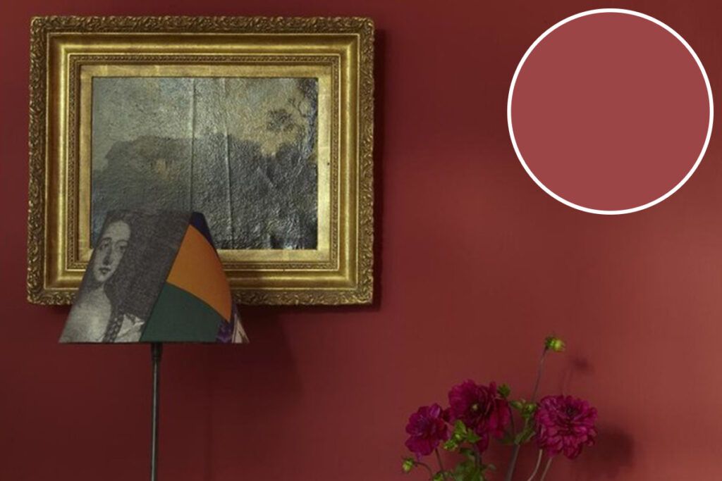
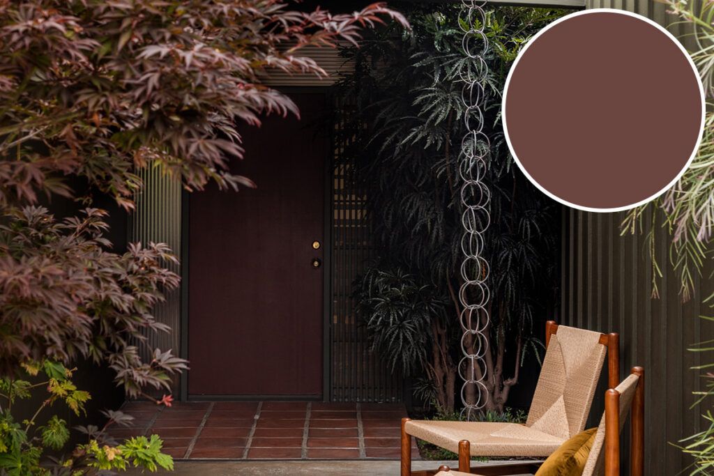
1. Farrow & Ball Deep Reddish Brown
For Los Angeles designer Meghan Eisenberg, principal of Studio Meghan Eisenberg, the answer to “What’s the best front door paint color?” comes without hesitation. “That’s easy!” she exclaims. Her pick: Deep Reddish Brown by Farrow & Ball. “I love a burgundy door,” Eisenberg says. “It’s a universal color that lends itself to many architectural styles. While some contrast doors might feel kitschy, this color feels classic.”
2. Benjamin Moore Wythe Blue
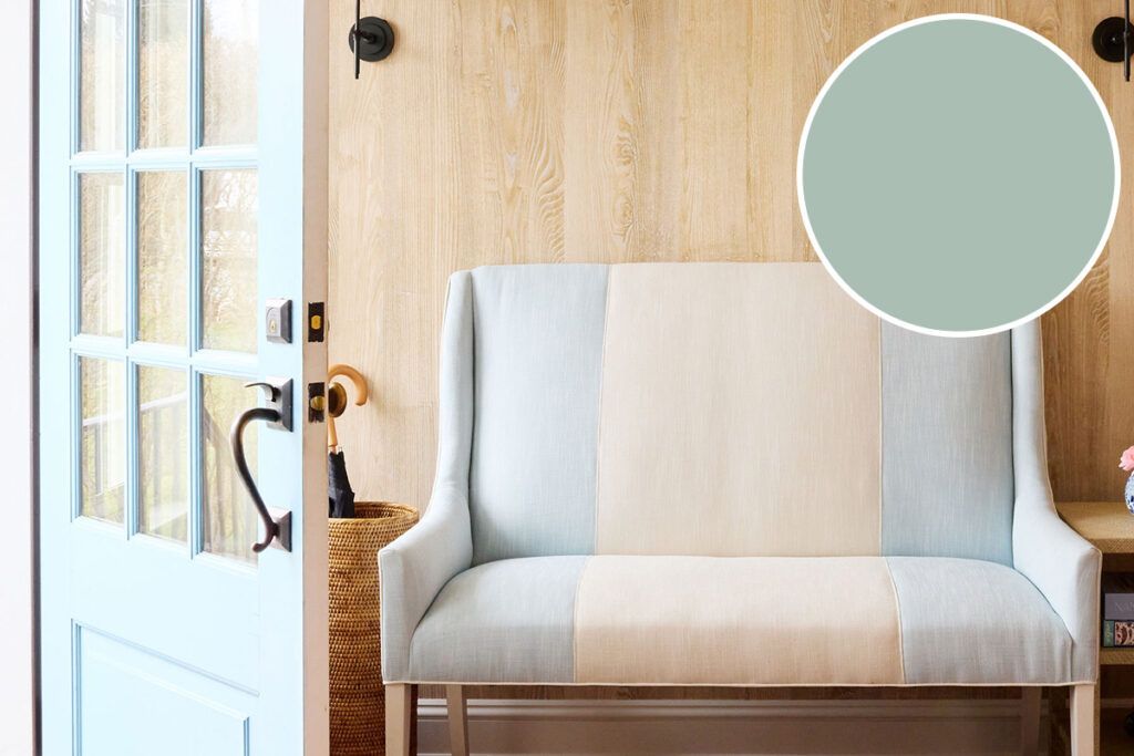
For coastal charm without going full nautical, Kelsey Peterson of Style and Space — an interior design firm serving Westchester County and New York City — reaches for Wythe Blue by Benjamin Moore. It’s a soft, chalky blue-green with a faint gray undertone. “It’s one of my favorite colors for curb appeal,” Peterson says. She recommends pairing it with light gray or white siding for a fresh, inviting feel.
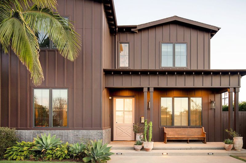
3. Farrow & Ball Dead Salmon
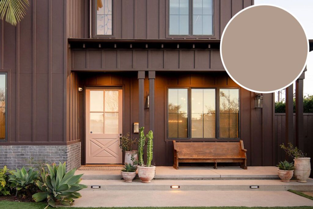
Los Angeles interior designer Andee Ferrer gravitates toward Dead Salmon from Farrow & Ball, which she calls “a beautifully nuanced, aged salmon pink that often reads more like a warm mushroom or [a] buff neutral.” As the light changes throughout the day, so does the color, from a soft blush to a rich taupe, making it one of the more versatile exterior paint colors. Ferrer likes to pair it with deep browns and lush greenery for an especially polished look. “It’s the kind of front door color that always feels welcoming,” she says.
More from our network
House Outlook is part of Inbox Studio, which publishes content that uplifts, informs, and inspires.



4. Benjamin Moore Black Beauty
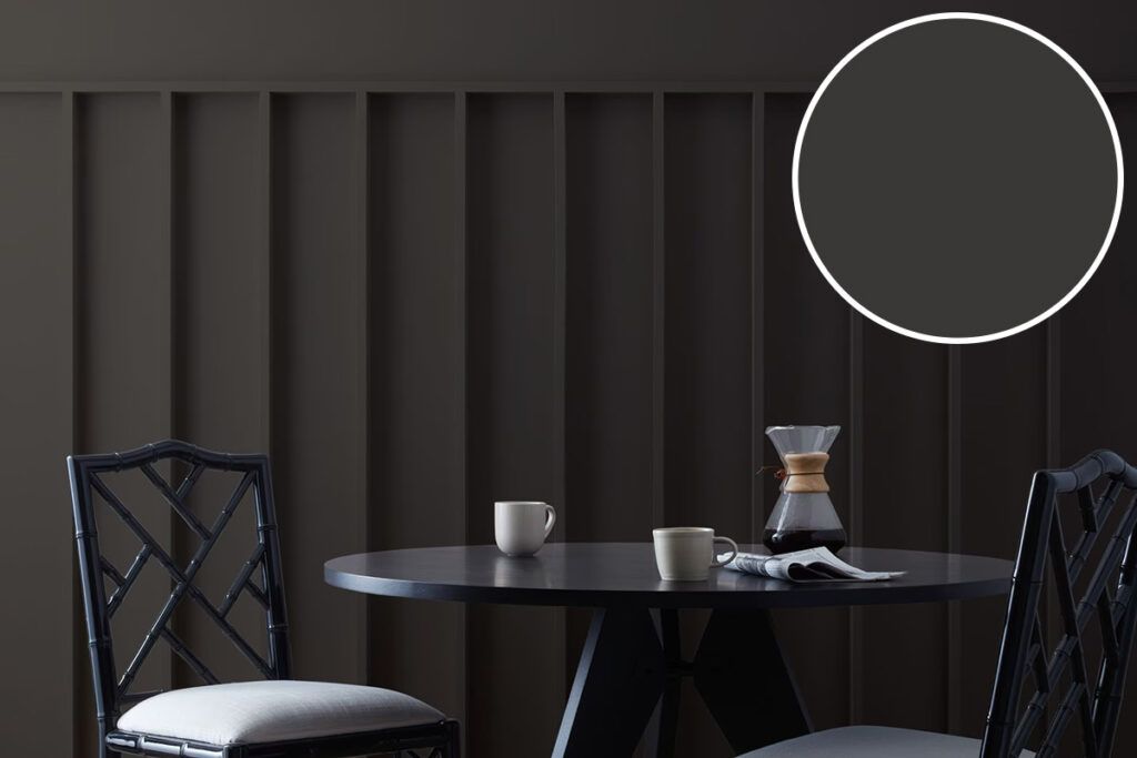
When a home begs for a moody front door color, Peterson turns to Benjamin Moore Black Beauty, a rich black that reads as timeless and sophisticated on nearly any home exterior. “It gives incredible contrast against light siding or brick and instantly elevates curb appeal without feeling trendy,” Peterson says.
5. Benjamin Moore Weekend Getaway
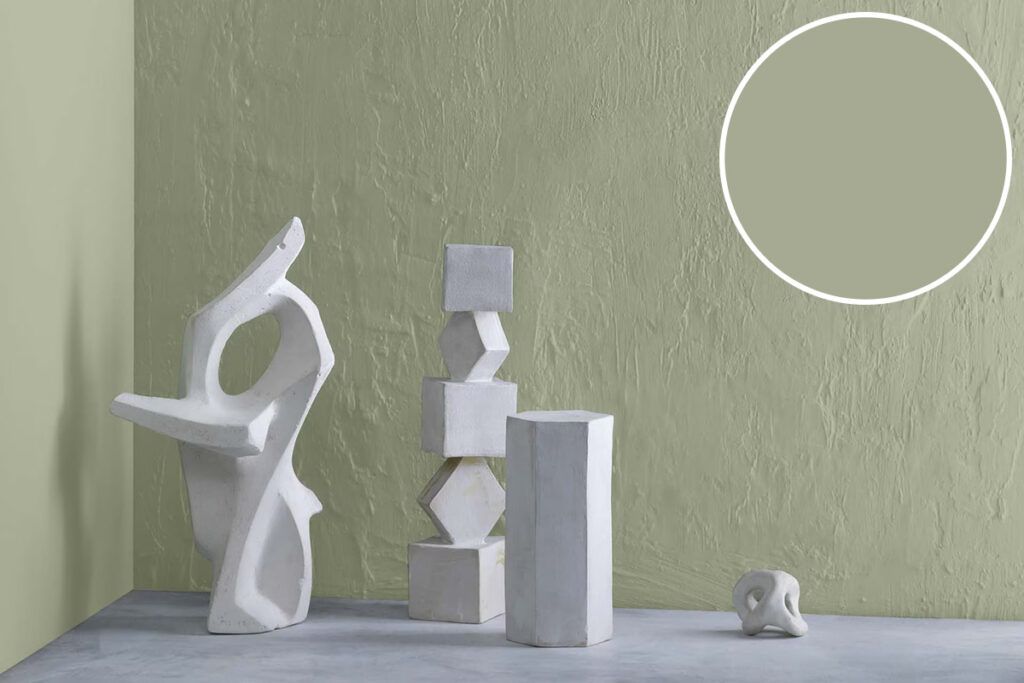
Southern designer Emily Ryan, the founder of @littlehouseofchic, favors Benjamin Moore Weekend Getaway, a warm medium green with just enough subtle gray undertones to give it a well-balanced, inviting feel. “Timeless yet fresh, it’s a versatile front door color that complements everything from white clapboard cottages to stately brick homes while adding understated curb appeal,” Ryan says.
6. Fine Paints of Europe Porch Ceiling Blue
Designer Jen Potter, owner of the boutique textile and home decor brand Fete Home, chose Porch Ceiling Blue by Fine Paints of Europe in the Hollandlac Brilliant finish for her Connecticut home. (Perhaps her color confidence comes from working alongside legendary interior designer Bunny Williams.) “I’ve always loved a high-gloss front door — it feels like a piece of jewelry for the home, welcoming guests with a little charm and shine,” Potter says. “This subtle, calming blue instantly made me happy when I found it, and it seems to have the same effect on friends when they visit.”
7. Benjamin Moore Foxglove Bloom
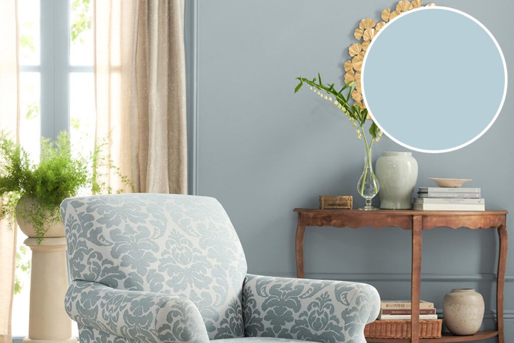
Becky Ducsik, president and creative director of the Seattle-based interior design firm and home decor store The Phinery, doesn’t shy away from color. “Bold, playful, and full of personality, Benjamin Moore’s Foxglove Bloom is a showstopping hot pink that transforms a front door into an unforgettable focal point,” she says. It’s especially striking against a crisp white exterior with black accents, and for an extra dose of glamour, Ducsik recommends a high-gloss finish and antique brass hardware.
8. Farrow & Ball Incarnadine
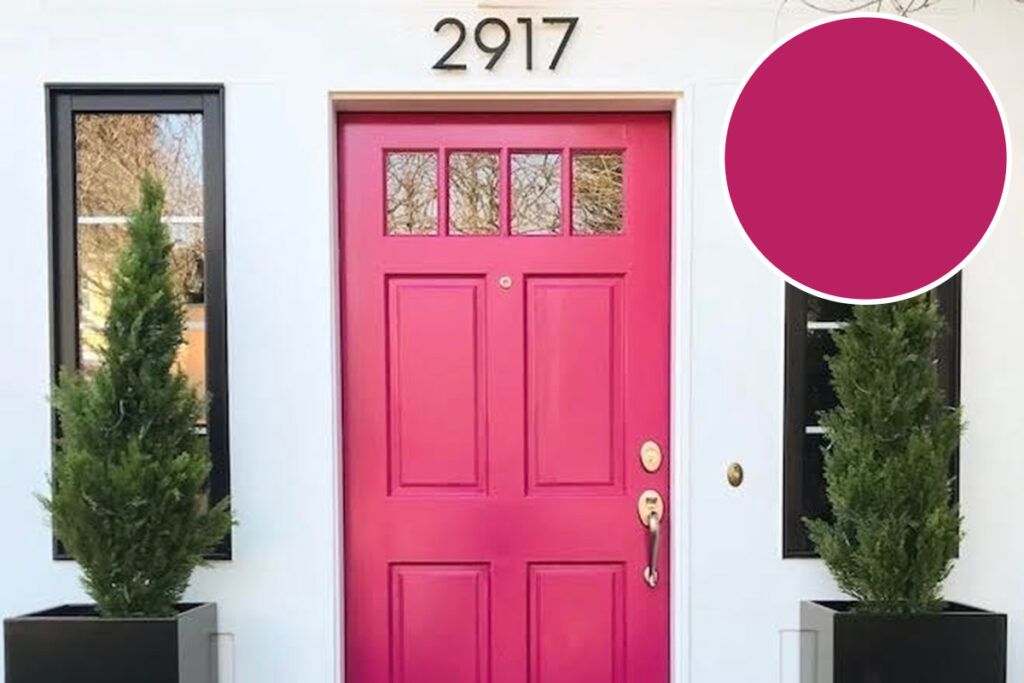
Down for some drama? Peterson also loves Farrow & Ball Incarnadine, a bold, saturated red-pink that makes a statement. “It’s a wonderful way to bring personality and warmth to an entryway, especially on more traditional or classic homes that could use a playful, unexpected pop of color,” Peterson says.