“In a small space, I never want the paint color to be the only thing you notice,” she says. “It’s less about how dark a color is and more about saturation, undertone, contrast, and how the color interacts with the light in the room.”
Here are six paint colors to steer clear of in a small space — and what to reach for instead.
1. Cool White
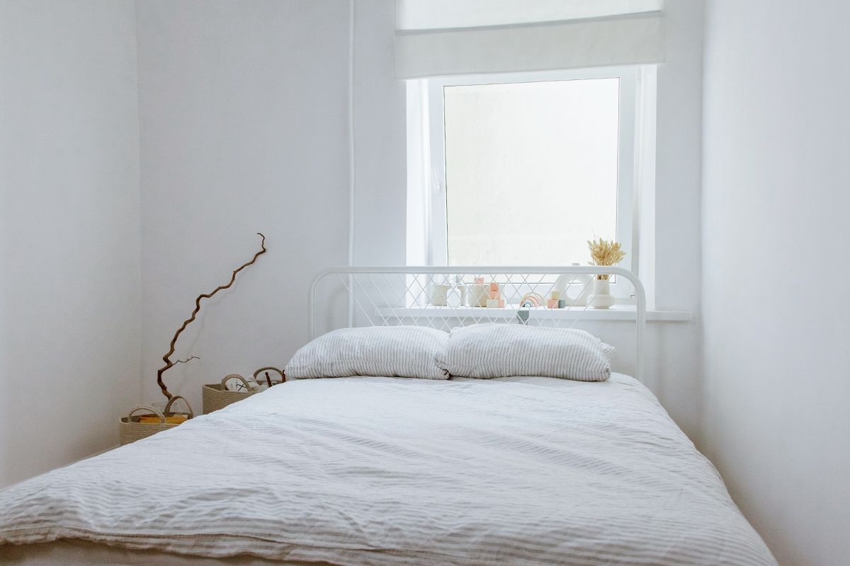
White walls can feel like a safe bet, but it’s a misconception that painting everything (including the walls, ceiling, trim, and doors) white is the secret to making a room feel larger. Sometimes it does the opposite, Blalock says.
“A stark, cool white can actually make you much more aware of the boundaries of a room,” she explains. “Every corner, shadow, ceiling line, and architectural transition becomes incredibly crisp, so your eye starts registering exactly where the room begins and ends.” Instead, opt for a warm, nuanced white, which will add more depth. “Softening those transitions can do much more for a room than simply making everything as white as possible.”
More from our network
House Outlook is part of Inbox Studio, which publishes content that uplifts, informs, and inspires.



2. Primary Red
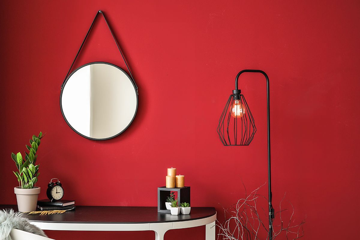
There’s a big difference between a nuanced oxblood or muddy brick versus a true primary red you’d find in a crayon box. “Bright red carries so much visual weight that in a small room it can feel like the walls are coming toward you,” Blalock says. “There’s also nowhere to get distance from the color, so you’re constantly experiencing it at full intensity.”
If your heart is set on red, she suggests a deeper tone — burgundy, oxblood, rust, or a brown-based red — which will add richness without overwhelming you.
3. Bright Orange
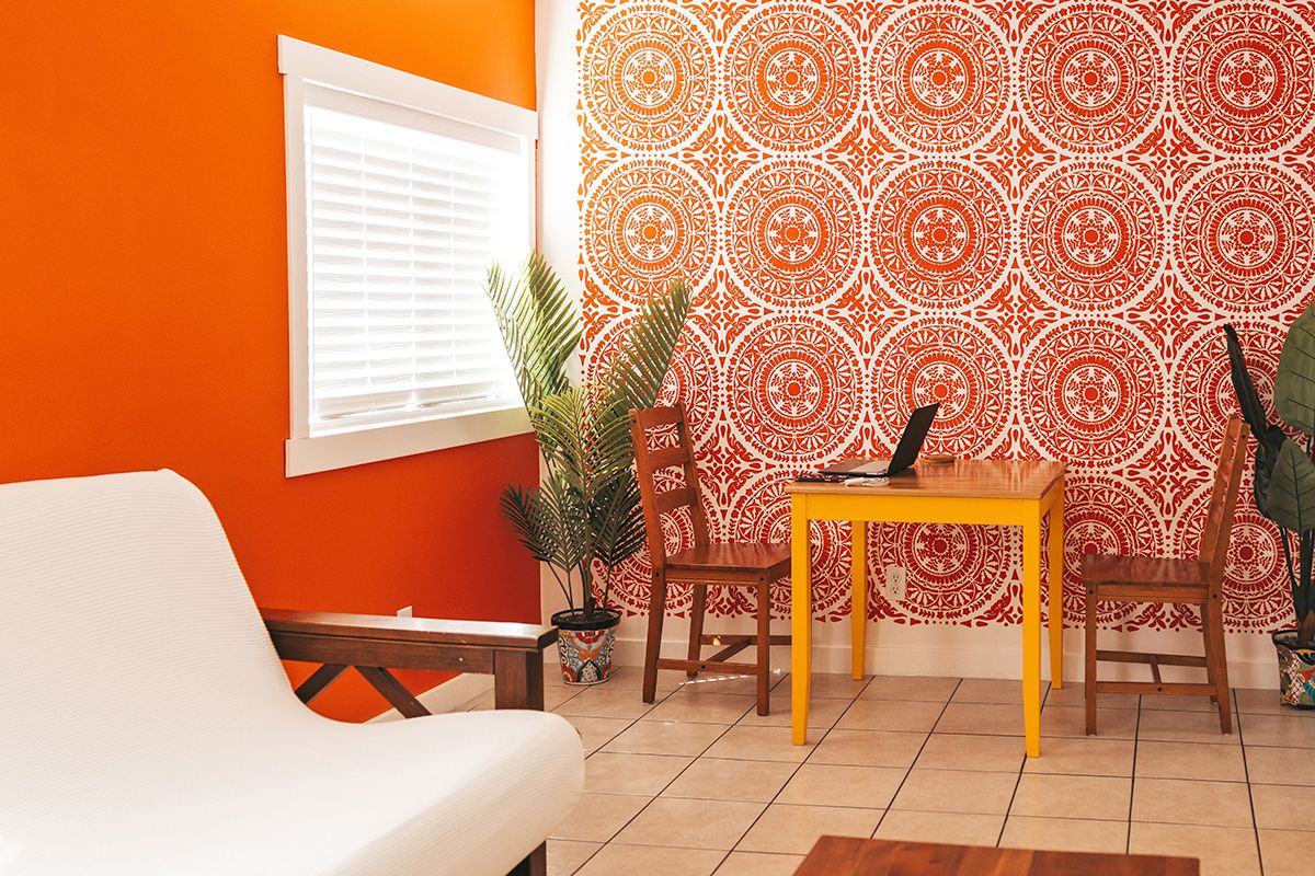
Orange has a similar problem to red. A bright, saturated version is guaranteed to take over a small room. Instead of a true orange, consider its more complex cousins. “Terra-cotta, burnt orange, ochre, tobacco, or a muddy apricot can give you that warmth while still allowing everything else in the room — art, furniture, wood, stone, textiles — to have a voice,” Blalock says.
4. Electric Yellow
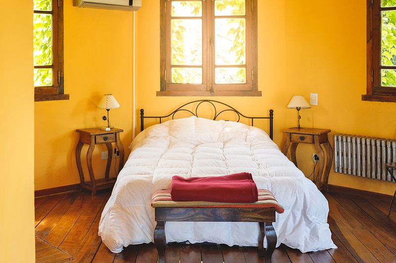
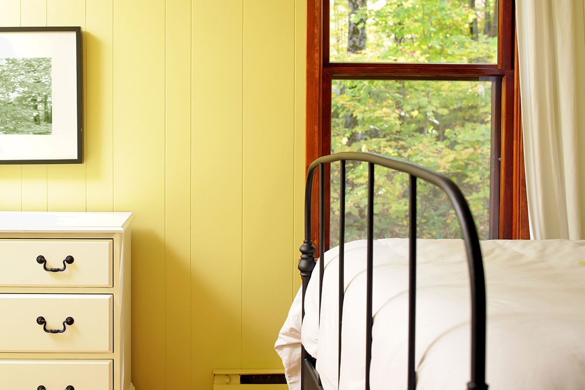
Before you dip a roller into a gallon of highlighter yellow, beware of its intensifying effects not only on walls, but on everything else in the space too. “Suddenly your flooring, furniture, fabrics, and even the light itself can start taking on that undertone,” Blalock warns.
She’s a fan of buttery or ochre-toned yellows, which layer easily with antiques, natural materials, wood tones, art, and patterns. Bright yellow doesn’t offer the same flexibility. “An electric yellow is much harder to create that same depth with, particularly when you don’t have a lot of square footage to balance it,” Blalock says.
5. Lavender
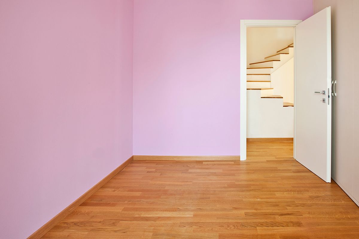
Be mindful of a lavender paint’s undertone. Depending on the light, lavender can turn cool or almost gray, which can flatten a space rather than expand it. If you want to work in that color family, Blalock recommends dustier or deeper tones rather than a straightforward pastel lavender.
“We generally gravitate toward colors that are a little difficult to name, something that changes throughout the day and has enough complexity to work with everything else happening in the room,” she says.
6. Hot Pink
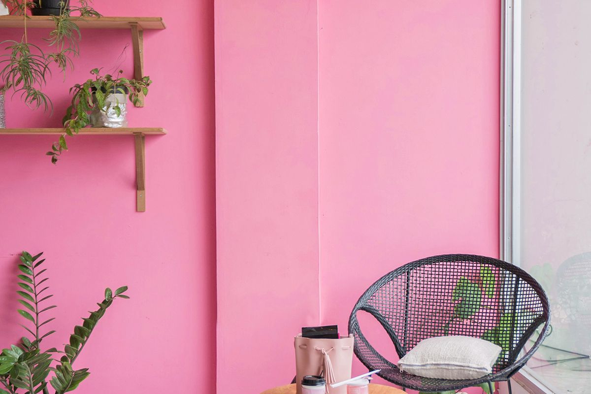
Saturated pink walls can overwhelm the identity of a small room, making occupants feel like they’ve stepped into a Barbie DreamHouse. Select a shade of pink — blush, plaster pink, or brownish rose — that’ll work in your favor.
“Those tones can function almost like a neutral and look beautiful with dark woods, stone, antiques, and patterned textiles,” Blalock says. “The more nuanced version of a color is almost always more interesting than the most obvious version of it.”
Bonus Tip: Don’t Forget the Finish
A paint’s sheen is nearly as important as the color. When in doubt, opt for eggshell or matte. Semi-gloss reflects more light, but that doesn’t necessarily make a small room feel bigger; it can also highlight every imperfection in the drywall. Sheen can create a lacquered or jewel-box-like feel, which can be perfect for a small space like a powder room.