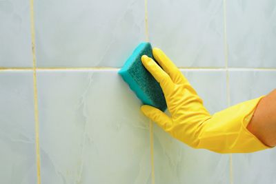
How To Keep Hard-Water Stains Off Shower Glass for Weeks

The Designer-Approved Trick To Hide Ugly Lamp Cords
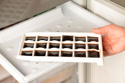
The No-Cost Hack for Better Iced Coffee

How To Water Your Garden Just Once a Week This Summer

9 Ways To Make Your House Look Occupied While You’re Away

12 Things You Should Never Store in the Basement

Decorating
The Designer-Approved Trick To Hide Ugly Lamp Cords
This clever design trick conceals unsightly lamp cords to take your reading nook from messy to picture-perfect.
READ MORE


Add House Outlook to your inbox
We’re on a mission to make your home a better place to live. House Outlook’s daily newsletter is filled with expert advice to help you organize, clean, and improve the place you call home.
Please enter valid email.
By clicking “Subscribe” you are agreeing to the brand’s Privacy policy and Terms of use.


TOP ARTICLES

Cleaning
The 5-Second Fix for a Fresher-Smelling Trash Can
Of all the chores required to keep a household running smoothly, maintaining an odor-free trash can might be the trickiest. Keeping a trash can indoors is generally unavoidable, and so is throwing awa...
Jun 9, 2026

Food & Drink
The Oven Rack Position Nobody Uses (But Should)
All home ovens have a few things in common, whether they run on gas or electricity: They feature multiple rack positions, include two or three racks, and have notoriously shaky <a href="https://houseo...
Jun 9, 2026

Food & Drink
How To Double the Shelf Life of Your Cucumbers
When the weather is hot, cucumbers are an excellent way to cool down. You can slice them up and put them in your water, marinate them in soy sauce and rice vinegar for a smashed salad, or blend them i...
Jun 2, 2026

Cleaning
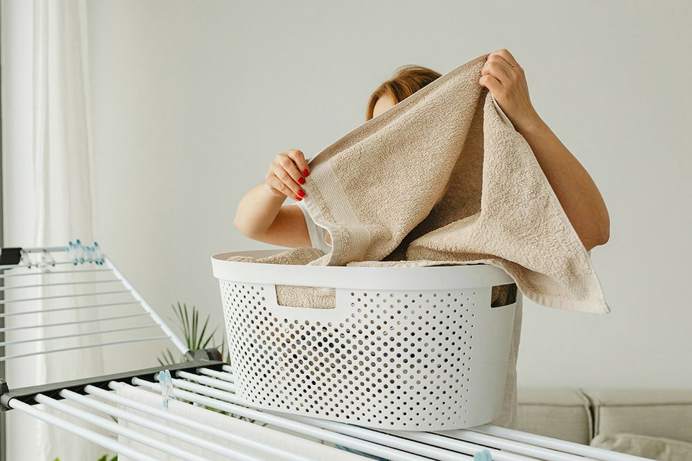
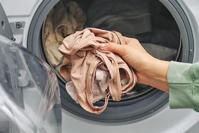
The Extra Dryer Step That Removes 2x More Pet Hair
As much as we love our pets, their shedding can cause major headaches. No one wants to invite guests to sit on a dark sofa covered in schnauzer hair, or discover their favorite sweater is coated in ca...
May 26, 2026

Decorating
Most People Set Up Their Homes Backward
If the thought of decorating your home feels overwhelming, step away from your online cart, leave the vintage store, and don’t even glance toward the paint chips. The problem isn’t you; it’s you...
May 26, 2026

Food & Drink
The Trick to Keeping Salad Greens Crisp All Week
Salads are an easy way to add greens and other produce to your diet. They’re extremely versatile and — when done right — delicious. The biggest challenge in making a salad at home is keeping the...
May 15, 2026