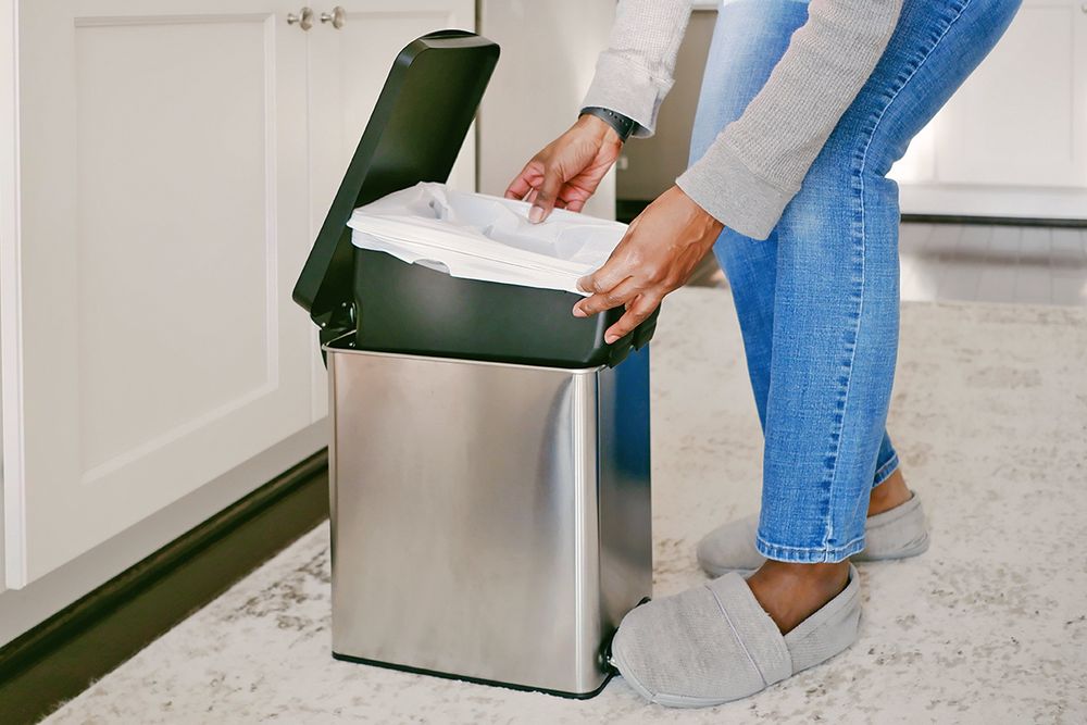
9 Things You Should Be Cleaning Every Single Day

7 IKEA Pieces Designers Secretly Love (and Use in Their Own Homes)
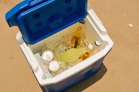
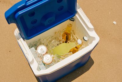
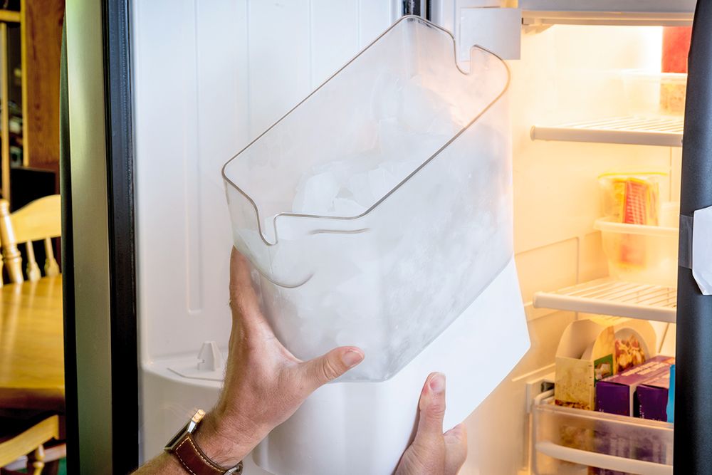
Why Your Cooler Ice Melts So Fast (And How To Fix It)

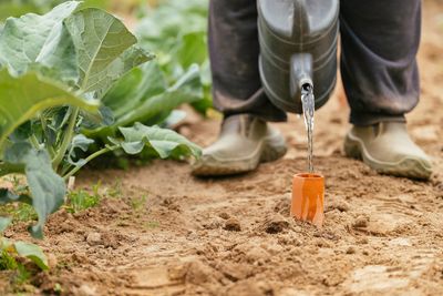
How To Water Your Garden Just Once a Week This Summer

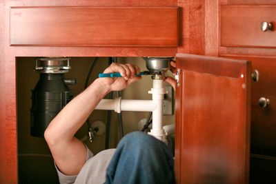
6 Daily Habits That Are Slowly Ruining Your Pipes

12 Things You Should Never Store in the Basement

Cleaning
9 Things You Should Be Cleaning Every Single Day
Unlike a dedicated cleaning day, these small practices take only a few minutes, yet they yield a substantial payoff.
READ MORE


Add House Outlook to your inbox
We’re on a mission to make your home a better place to live. House Outlook’s daily newsletter is filled with expert advice to help you organize, clean, and improve the place you call home.
Please enter valid email.
By clicking “Subscribe” you are agreeing to the brand’s Privacy policy and Terms of use.
TOP ARTICLES

Food & Drink
The Trick to Keeping Salad Greens Crisp All Week
Salads are an easy way to add greens and other produce to your diet. They’re extremely versatile and — when done right — delicious. The biggest challenge in making a salad at home is keeping the...
May 15, 2026

Food & Drink
3 Must-Try Grilling Hacks for the Juiciest Burgers of Your Life
The snow has melted, the flowers are blooming, and every other video that comes across your feed features somebody brandishing tongs in a billow of smoke. Grilling season has officially arrived. While...
May 8, 2026

Home Improvement
The Dishwasher Setting That’s Costing You Money
To anyone managing a busy household, helpful shortcuts are always welcome when tidying up. But there’s one common dishwasher shortcut that costs you more money than you may realize.
May 8, 2026

Cleaning
You’re Cleaning Your Toilet Wrong
There’s no sugarcoating it: Toilets are among the germiest places in any home. Regular cleaning is essential, but far too many of us are doing it wrong. It’s not so much a matter of frequency or t...
May 5, 2026

Food & Drink
This Clever Trick Hides Appliance Cords in Plain Sight
We all know how precious kitchen counter space can be. This coveted area is used daily for everything from brewing your morning coffee to chopping up ingredients for dinner, so keeping things orderly ...
May 5, 2026

Gardening
Your Backyard Needs a ‘Mosquito Bucket of Doom’
Few things are as universally reviled as mosquitoes. These pesky little critters can ruin a beautiful evening, leaving you covered in itchy red bumps that can plague you for weeks. If the infestation ...
May 5, 2026