The Diaper Bag Essential Pros Use To Spot-Clean Upholstery

The Best Matchstick Alternative Is Hiding in Your Pantry

7 Foods You Should Never Store in Plastic Containers

You’re Watering Your Garden Wrong (and Wasting Water)

Your Doorstop Has a Brilliant Second Use

7 Places in Your Home That Aren’t Safe for Storage
Organizing
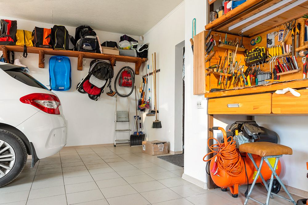
7 Places in Your Home That Aren’t Safe for Storage
The problem isn’t just that items get ruined; it’s that poor storage placement can compromise your home’s safety over time.
READ MORE


Add House Outlook to your inbox
We’re on a mission to make your home a better place to live. House Outlook’s daily newsletter is filled with expert advice to help you organize, clean, and improve the place you call home.
Please enter valid email.
By clicking “Subscribe” you are agreeing to the brand’s Privacy policy and Terms of use.


TOP ARTICLES

Food & Drink
Why Chefs Put Vinegar in Their Scrambled Eggs
Scrambled eggs are one of the most basic dishes imaginable, and one of the first things many of us learn how to cook. Preparing them is much easier than flipping an omelette, or trying to nail a perfe...
Jun 30, 2026

Cleaning
The Best Stain Remover Is in Your Bathroom Cabinet
There’s no headache like the one caused by a stubborn stain on your favorite T-shirt. Stains are frustrating not only because most<em> </em>of them refuse to budge, but also because they require spe...
Jun 30, 2026

Cleaning
The Overlooked Reason Your Home Is Always Dusty
While many of us are quick to welcome cats and dogs into our homes, there are certain creatures no homeowner wants to deal with. This list typically includes mice (not including pets), cockroaches, an...
Jun 22, 2026

Cleaning
The 5-Second Fix for a Fresher-Smelling Trash Can
Of all the chores required to keep a household running smoothly, maintaining an odor-free trash can might be the trickiest. Keeping a trash can indoors is generally unavoidable, and so is throwing awa...
Jun 9, 2026

Food & Drink
The Oven Rack Position Nobody Uses (But Should)
All home ovens have a few things in common, whether they run on gas or electricity: They feature multiple rack positions, include two or three racks, and have notoriously shaky <a href="https://houseo...
Jun 9, 2026

Food & Drink
How To Double the Shelf Life of Your Cucumbers
When the weather is hot, cucumbers are an excellent way to cool down. You can slice them up and put them in your water, marinate them in soy sauce and rice vinegar for a smashed salad, or blend them i...
Jun 2, 2026